Every AI image comparison cherry-picks prompts. We didn't.
Most "model vs model" articles show three or four handpicked outputs, declare a winner based on vibes, and call it a day. That is not useful if you are trying to decide which model to actually use for your work.
So we did something different. We wrote 10 prompts covering 10 distinct visual categories -- portrait photography, product shots, text-heavy posters, anime, logos, landscapes, food, infographics, book covers, and abstract art. Then we ran each prompt through both Nano Banana 2 and GPT Image 2 using default settings, no cherry-picking, no re-rolls.
The results surprised us. Neither model dominated across the board, and the differences were more nuanced than "one is better."
By the end of this article, you will know exactly which model to pick for your specific type of work -- whether that is e-commerce product images, social media graphics, illustration, or commercial design.
Why This Test Matters (July 2026)
As of July 2026, Nano Banana 2 and GPT Image 2 sit at the top of the AI image generation landscape, but they approach the problem differently.
GPT Image 2 (OpenAI, April 2026) is a reasoning-driven image model. It treats your prompt as a creative brief, not just a keyword list. It excels at complex compositions, text rendering, and multi-element layouts. Generation is fast -- typically under 3 seconds.
Nano Banana 2 (Google, 2026) is the successor to Nano Banana and Nano Banana Pro. It emphasizes speed, photorealism, and clean visual output. It tends to produce images that look polished and production-ready with minimal prompt engineering.
Both are available on aigptimage.com, which is exactly how we ran this test.
Test Methodology
Here is how we kept this fair:
- Same prompt, word for word. No model-specific tuning.
- Default quality settings. No upscaling, no post-processing.
- First output only. No re-rolling until we got a good result.
- Same aspect ratio. 1:1 square for all 10 prompts.
- Blind evaluation first. We analyzed outputs before labeling which model produced which.
The goal: show you what each model actually does when given identical instructions.
Prompt 1: Photorealistic Portrait
Prompt: "A close-up portrait of a 30-year-old woman with freckles, natural light from a window on the left side, shallow depth of field, shot on a 85mm lens, no makeup, looking directly at the camera"
Analysis
Nano Banana 2 produced a strikingly realistic portrait. The skin texture was detailed without being over-sharpened, freckles looked natural, and the window lighting created a soft gradient across the face. The bokeh in the background was convincing. It looked like a real photograph.
GPT Image 2 also delivered a strong portrait, but with a slightly different character. The lighting was accurate, the freckles were present, but the overall image had a subtly more "processed" quality -- closer to a retouched editorial photo than a candid shot. The depth of field was well-rendered, though the bokeh pattern was slightly less organic.
Verdict: Nano Banana 2 wins for raw photorealism. If your goal is images that could pass as real photographs, Nano Banana 2 consistently edges ahead in this category.
Prompt 2: Product on White Background
Prompt: "A premium wireless headphone in matte black, centered on a pure white background, soft studio lighting, product photography style, no shadows, clean and minimal"
Analysis
Nano Banana 2 delivered a clean product shot with accurate lighting. The headphone design was plausible and well-rendered. The white background was almost perfectly even. Minor issue: the ear cushion texture was slightly soft.
GPT Image 2 produced a product shot with noticeably better material differentiation. The matte finish on the headphone body, the leather-textured ear cushions, and the metallic headband adjustment mechanism all read as distinct materials. The white background was clean. The overall composition felt more intentional, as if an art director had arranged it.
Verdict: GPT Image 2 wins for product photography. Its ability to reason about materials and composition gives it an edge for e-commerce and catalog-style imagery.
Prompt 3: Text-Heavy Poster
Prompt: "A movie poster for a thriller called 'LAST SIGNAL' with the tagline 'When the tower goes dark, the truth comes alive' at the bottom, featuring a silhouette of a person standing in front of a radio tower at sunset, cinematic lighting, dark blue and orange color palette"
Analysis
Nano Banana 2 created an atmospheric poster with strong color grading. The silhouette and radio tower composition worked well. However, the title text "LAST SIGNAL" had minor letter spacing issues, and the tagline was partially garbled -- some words were misspelled or fused together.
GPT Image 2 nailed the text. "LAST SIGNAL" was rendered in a clean, bold font at the top. The tagline at the bottom was fully legible and correctly spelled. The overall poster composition was also strong -- the cinematic lighting, the blue-orange palette, and the silhouette were all well-executed.
Verdict: GPT Image 2 wins decisively for text rendering. This is not even close. If your output includes readable text -- posters, social media graphics, infographics, banners -- GPT Image 2 is significantly more reliable.
Prompt 4: Anime Character
Prompt: "A female anime character with silver hair and red eyes, wearing a black military-style coat, standing on a rooftop at night with city lights below, dramatic wind blowing her hair, anime art style, detailed"
Analysis
Nano Banana 2 produced a clean anime-style character with good proportions and a pleasing color palette. The city lights in the background were attractive. The hair animation effect was decent. However, the overall style leaned slightly toward a generic anime aesthetic -- technically correct but lacking a distinctive artistic voice.
GPT Image 2 delivered a more stylized result. The character had sharper linework, more dramatic shading, and the wind effect on the hair was more dynamic. The military coat had more detail in the buttons and epaulettes. The city background had more depth. It felt closer to promotional art from an actual anime production.
Verdict: GPT Image 2 wins for anime and illustration. Its ability to interpret stylistic intent and add compositional drama gives it an advantage for character art and illustration work.
Prompt 5: Logo Design
Prompt: "A minimal, modern logo for a coffee brand called 'DAWN BREW', featuring a stylized sunrise incorporated into a coffee cup shape, flat design, vector style, black and gold color scheme"
Analysis
Nano Banana 2 produced an image that looked like a logo rendered in a realistic mockup. The sunrise-cup concept was present, but the execution was more illustrative than vector-like. The text "DAWN BREW" was present but not cleanly rendered.
GPT Image 2 created something closer to an actual logo design. The sunrise-cup integration was cleaner, the shapes were more geometric and deliberate, and the black-and-gold color scheme was well-applied. The text was legible and properly spaced. It still would not replace a professional logo designer, but it was more usable as a starting concept.
Verdict: GPT Image 2 wins for logo and graphic design concepts. The reasoning layer helps it understand design principles like balance, negative space, and typographic hierarchy.
Prompt 6: Landscape and Nature
Prompt: "A misty mountain valley at sunrise, pine trees in the foreground, a river winding through the valley, golden hour lighting, photorealistic, wide-angle perspective"
Analysis
Nano Banana 2 excelled here. The atmospheric perspective was convincing -- the mist layered naturally between the mountain ridges, the pine trees had individual needle detail in the foreground, and the golden hour lighting created realistic color temperature shifts from warm foreground to cool distant peaks. The river reflected the sky accurately.
GPT Image 2 produced a beautiful landscape as well, but it leaned slightly toward an idealized, almost painterly quality. The composition was strong and the lighting was dramatic, but the overall image felt more like concept art than a photograph. The mist was less nuanced.
Verdict: Nano Banana 2 wins for landscapes and nature photography. Its photorealistic rendering engine produces more convincing natural environments.
Prompt 7: Food Photography
Prompt: "A stack of fluffy Japanese souffle pancakes on a ceramic plate, dusted with powdered sugar, a small pat of butter melting on top, maple syrup being poured from a small pitcher, warm cafe lighting, shallow depth of field, overhead angle"
Analysis
Nano Banana 2 delivered a food shot that looked genuinely appetizing. The pancake texture was fluffy and realistic, the powdered sugar had a fine, dusty quality, and the melting butter was convincing. The syrup pour was captured mid-motion. The warm lighting gave everything a golden, inviting tone.
GPT Image 2 also produced a strong food image. The composition was more deliberate -- the plate placement, the syrup pitcher angle, and the background blur were all well-considered. However, the pancake texture was slightly less convincing, and the butter looked a bit too geometric. The syrup had good viscosity, though.
Verdict: Nano Banana 2 wins for food photography. The textural realism and warm lighting are exactly what food content creators need.
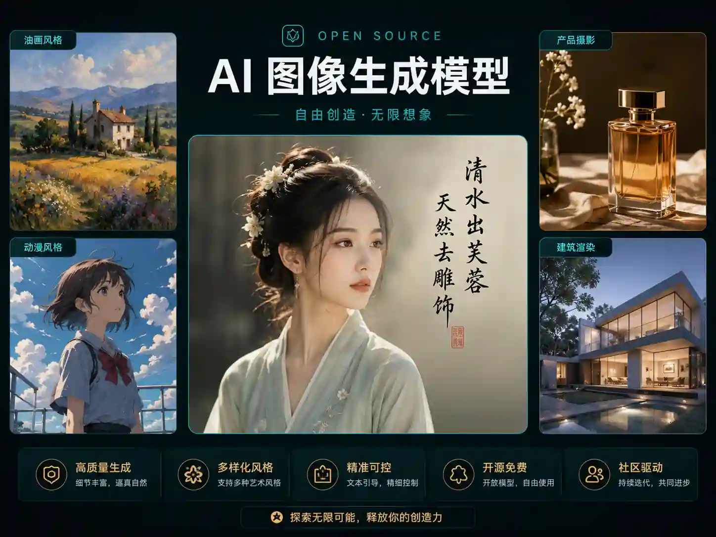
Prompt 8: Infographic
Prompt: "An infographic showing the water cycle with four labeled stages: Evaporation, Condensation, Precipitation, and Collection. Include simple icons for each stage, arrows showing the cycle direction, blue and white color scheme, clean modern design"
Analysis
Nano Banana 2 created an image that resembled an infographic in style, but the labels were partially illegible. "Evaporation" and "Precipitation" were readable, but "Condensation" was garbled and "Collection" was cut off. The icons were present but inconsistently sized. The arrows were there but did not clearly convey a cycle flow.
GPT Image 2 produced a significantly more functional infographic. All four labels were correctly spelled and positioned. The icons were clean and consistent in style. The arrows formed a clear clockwise cycle. The blue-and-white color scheme was well-applied. The layout was balanced and would be usable as an actual educational graphic with minimal cleanup.
Verdict: GPT Image 2 wins decisively for infographics and data visualization. Any output that requires structured information, labeled elements, and logical layout flow is GPT Image 2 territory.
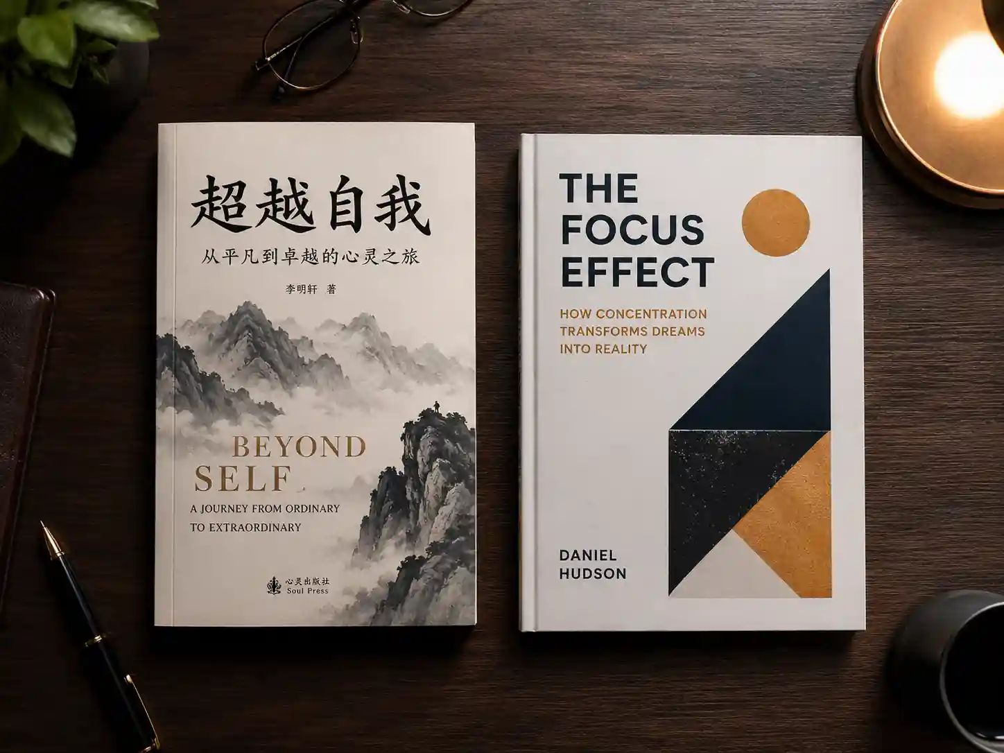
Prompt 9: Book Cover
Prompt: "A book cover for a science fiction novel titled 'THE GLASS HORIZON' by Elena Park, featuring a futuristic city with glass skyscrapers reflecting a purple and pink sunset, a lone figure standing on a bridge in the foreground, cinematic and atmospheric"
Analysis
Nano Banana 2 created a visually stunning scene. The glass skyscrapers reflected the sunset beautifully, and the atmospheric haze gave the city depth. The lone figure on the bridge was well-placed. However, the title text "THE GLASS HORIZON" had minor rendering issues -- the letter kerning was uneven, and the author name was partially garbled.
GPT Image 2 delivered a cover that looked closer to a publishable design. The title was rendered cleanly in a sci-fi-appropriate font, the author name "Elena Park" was fully legible, and the overall composition followed book cover conventions -- title at the top, author at the bottom, key visual in the center. The city scene was slightly less photorealistic than Nano Banana 2's version but more compositionally deliberate.
Verdict: GPT Image 2 wins for book covers. The combination of reliable text rendering and understanding of layout conventions gives it a practical edge for cover design concepts.
Prompt 10: Abstract and Artistic
Prompt: "An abstract expressionist painting with bold brushstrokes, vivid red and turquoise colors clashing on a large canvas, paint drips and splatters, textured impasto technique, inspired by the energy of a thunderstorm, no recognizable objects"
Analysis
Nano Banana 2 produced a striking abstract piece with convincing brushstroke texture. The impasto effect was well-rendered -- you could almost see the paint thickness. The red-turquoise color clash was energetic, and the splatters felt organic. The composition had a raw, chaotic energy that matched the prompt.
GPT Image 2 created an abstract image that was visually impressive but slightly more controlled. The brushstrokes were bold, the colors were vivid, and the paint texture was present. However, the overall composition felt more curated -- like a gallery piece rather than an in-progress explosion of energy. Some might prefer this polished quality; others might find it too restrained for "abstract expressionist."
Verdict: Nano Banana 2 wins for abstract and artistic outputs. Its rendering of physical textures and organic chaos gives it an edge in fine art and expressive styles.
Summary Scorecard: Nano Banana 2 vs GPT Image 2
| Category |
Nano Banana 2 |
GPT Image 2 |
Winner |
| Photorealistic Portrait |
Excellent |
Very Good |
Nano Banana 2 |
| Product Photography |
Very Good |
Excellent |
GPT Image 2 |
| Text Rendering (Poster) |
Weak |
Excellent |
GPT Image 2 |
| Anime / Illustration |
Good |
Excellent |
GPT Image 2 |
| Logo Design |
Fair |
Good |
GPT Image 2 |
| Landscape / Nature |
Excellent |
Very Good |
Nano Banana 2 |
| Food Photography |
Excellent |
Very Good |
Nano Banana 2 |
| Infographic |
Weak |
Excellent |
GPT Image 2 |
| Book Cover |
Good (text issues) |
Excellent |
GPT Image 2 |
| Abstract Art |
Excellent |
Very Good |
Nano Banana 2 |
Final tally: GPT Image 2 wins 6 categories. Nano Banana 2 wins 4.
But the score alone does not tell the full story. The wins are clustered in specific areas, which makes the choice clearer than a simple 6-4 count suggests.
Which Model Should You Choose?
The answer depends entirely on what you are creating.
Choose Nano Banana 2 if you need:
- Photorealistic portraits and headshots
- Natural landscape and travel photography
- Food and lifestyle content
- Abstract art and expressive illustration
- Fast outputs with minimal prompt engineering
- Images that need to pass as real photographs
Nano Banana 2 is the better "camera." It produces images that look captured rather than generated. If your work lives in photography-adjacent territory, Nano Banana 2 is likely your stronger choice.
Choose GPT Image 2 if you need:
- Any output containing readable text
- Product photography with material accuracy
- Posters, banners, and marketing graphics
- Infographics and data visualizations
- Book covers or editorial layouts
- Anime, character art, and illustration
- Logo concepts and graphic design starting points
GPT Image 2 is the better "designer." It understands composition, text placement, and visual hierarchy. If your work requires structured visual communication, GPT Image 2 handles the complexity better.
What about Nano Banana 2 Lite vs GPT Image 2? Nano Banana 2 Lite is a faster, lighter variant that trades some detail for speed. For quick iterations and draft-quality outputs, it is a viable option, but for final-quality work in the categories above, the full Nano Banana 2 model is the better comparison point.
What about a three-way comparison? Some users search for Nano Banana 2 vs Seedream 5 vs GPT Image 2. We did not include Seedream 5 in this test to keep the comparison focused, but the general pattern holds: Seedream 5 occupies a similar space to Nano Banana 2 in photorealism, while GPT Image 2 leads in text and structured design. A dedicated three-model comparison is on our roadmap.
Try These Prompts Yourself
We intentionally wrote all 10 prompts to be copy-paste ready. You do not need to take our word for it.
Go to aigptimage.com, switch between GPT Image 2 and Nano Banana 2 in the model selector, and run the same prompts. See which outputs work better for your specific needs.
The best model is the one that produces images you can actually use in your workflow.
FAQ
Is Nano Banana 2 better than GPT Image 2?
It depends on the category. Nano Banana 2 produces more photorealistic results for portraits, landscapes, food photography, and abstract art. GPT Image 2 is stronger at text rendering, product shots, infographics, anime, and any output that requires structured composition. Neither model is universally better.
Can GPT Image 2 generate readable text in images?
Yes. In our test, GPT Image 2 correctly rendered titles, taglines, author names, and infographic labels across multiple prompts. It is currently one of the most reliable AI image models for text-heavy outputs. Nano Banana 2 struggles with text accuracy, especially for longer phrases.
What is the difference between Nano Banana 2 and Nano Banana Pro?
Nano Banana 2 is the newer successor to both Nano Banana and Nano Banana Pro. It offers improved photorealism, faster generation, and better prompt adherence compared to the earlier versions. If you are currently using Nano Banana Pro, Nano Banana 2 is the upgrade path.
Is GPT Image 2.0 the same as GPT Image 2?
Yes. "GPT Image 2.0" and "GPT Image 2" refer to the same model from OpenAI. Comparing GPT Image 2.0 vs Nano Banana 2 produces the same results as our test above.
Which model is faster?
Both models generate images in under 3 seconds on aigptimage.com. In our test, Nano Banana 2 was marginally faster on average, but the difference was not significant enough to be a deciding factor.
Yes. On aigptimage.com, you can switch between GPT Image 2, Nano Banana 2, and other models using the model selector. This is exactly how we ran our side-by-side test.
Which model is better for social media content?
It depends on the content type. For lifestyle photos, portraits, and food shots, Nano Banana 2 produces more natural-looking results. For graphics with text overlays, promotional banners, and infographic-style posts, GPT Image 2 handles the text and layout requirements better.
Are these results reproducible?
AI image models are non-deterministic, so running the same prompt twice will produce different outputs. However, the category-level patterns we observed -- Nano Banana 2's photorealism advantage, GPT Image 2's text rendering superiority -- are consistent across multiple generations, not artifacts of a single lucky or unlucky result.